Pace
I led the end-to-end design and research for Pace, a minimalistic running app designed to help runners stay motivated, track progress, and unlock achievements through a structured level system.
UX Design
6 weeks
UI Design
Branding
Testing
Role
Duration
Team


Prototype
Survey Link
User Flows
Google Form Results
Site Map
High-Fidelity Wireframes File
Personas
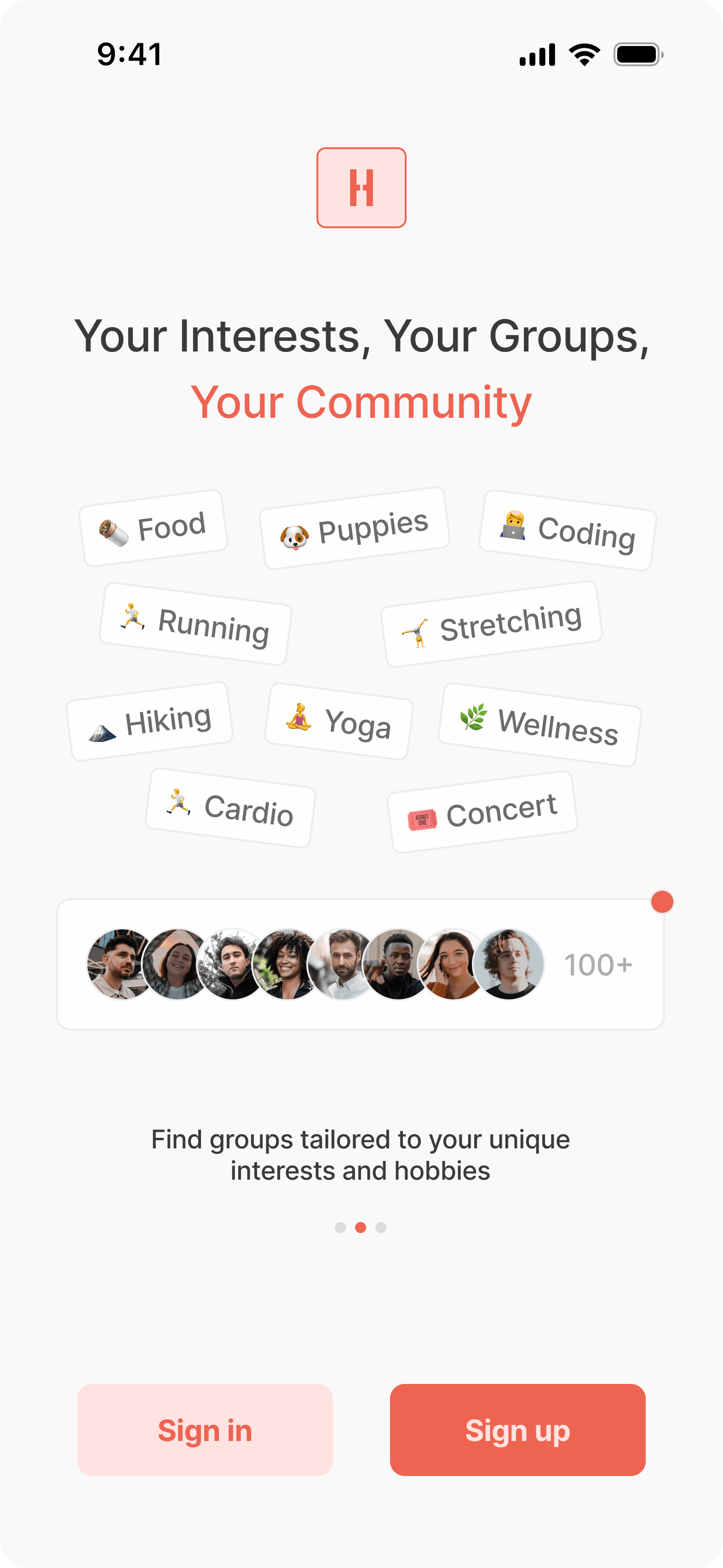
Pace is a beautifully designed, minimalistic running app that addresses the need for runners to have a clean, distraction-free way to track their pace, distance, and time. Unlike other apps that overwhelm users with excessive features, Pace provides an intuitive and aesthetically pleasing platform that prioritizes simplicity, functionality, and the joy of running.
Running apps today often try to cater to every possible fitness need, resulting in feature overload and a cluttered experience. This complexity distracts users from the core purpose of these apps: enhancing their running journey.
Pace was born out of the idea that simplicity and elegance can transform the running experience. By focusing only on the essentials, Pace aims to strip away unnecessary distractions, creating an app that feels like an extension of the runner’s mindset—calm, focused, and purposeful.
What is Pace?
Background
Running
35%
Workout & Training
30%
Yoga & Wellness
20%
Diet & Nutrition
15%
Other
10%
Running apps account for the largest share of the global fitness app market, reflecting growing interest in running as a preferred form of exercise. (Grand View Research)
Workout & Training
84.6%
Other
15.4%
A significant majority of users value simplicity in design, highlighting the importance of clean interfaces for user engagement. (loopexdigital.com)
To better understand industry best practices, I conducted a competitive analysis of Nike Run Club, Strava, and Runna. The objective was to explore how these platforms design their user experiences, promote specific actions (like joining runs or setting goals), and establish a strong brand presence.
I reached out to 8 runners to complete a survey, aiming to gather diverse insights and understand the features and experiences people value when using running apps.
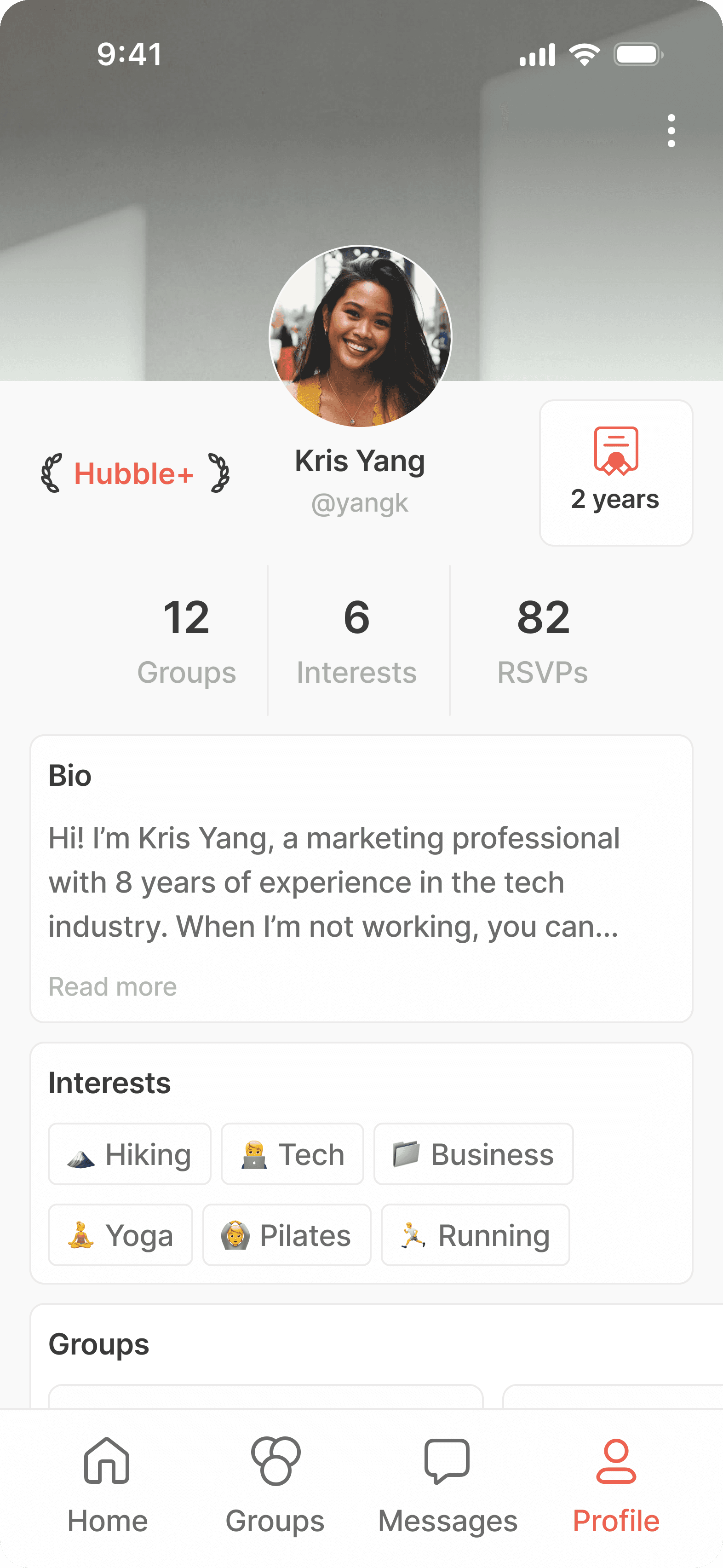
To ensure Pace met the needs of its target audience, I developed personas based on insights gathered from user research ensuring Pace addressed both casual and dedicated runners while maintaining its focus on simplicity and motivation.
In order to make correct decisions for the product going forward I took a step back to think about the overall user/business goals and how they overlap each other. This alongside thinking about potential technical considerations helped lay down a foundation towards final product.
To explore opportunities for innovation and align with user and business goals, I crafted a series of ‘How Might We’ (HMW) questions. These questions served as a foundation for brainstorming and ideation, helping me identify ways to enhance the user experience and address pain points effectively. Below are the key HMWs that guided the design process for Pace.
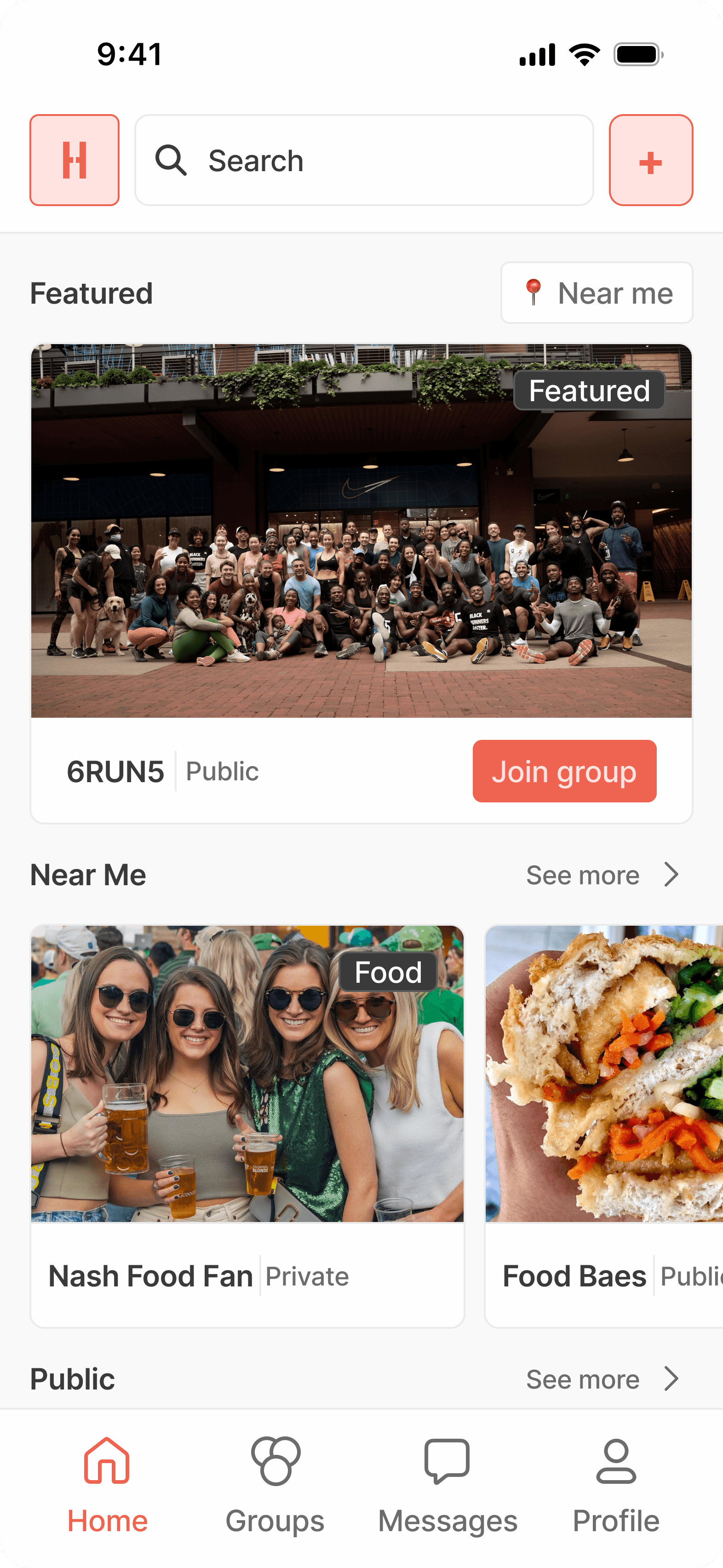
To showcase the user experience of Pace, I developed two key user flows: ‘Starting and Completing a Run’ and ‘Interacting with a Community Post.’
The ‘Starting and Completing a Run’ flow highlights how users can effortlessly begin a workout, track their progress, and review insights post-run. Meanwhile, the ‘Interacting with a Community Post’ flow demonstrates how users can engage with others by liking and commenting, fostering a connected and supportive running community. These flows emphasize Pace’s focus on simplicity, functionality, and community-driven motivation..
I began sketching low-fidelity wireframes to map out the core functionality and layout of Pace. These wireframes focused on maintaining a minimalistic design while ensuring a smooth and intuitive user flow.
The logo design for Pace reflects the app’s core values of simplicity, motivation, and progress. I explored concepts that conveyed movement and achievement while maintaining a minimalistic aesthetic that aligns with the app’s overall design language. The goal was to create a logo that resonates with runners of all levels and establishes a strong, memorable brand identity.
To validate the design and ensure it met user needs, I conducted usability testing with a diverse group of runners. The testing sessions focused on evaluating the ease of navigation, clarity of the gamified features, and overall user experience. Feedback from participants provided valuable insights, allowing me to identify pain points and refine the app’s functionality and interface to better align with user expectations.
Based on insights gathered from usability testing, I made several iterations to refine Pace’s design.
The Pace project highlights the potential of a running app designed to balance functionality, personalization, and community engagement. Through usability testing, we gained valuable insights into user behavior, preferences, and pain points. The app’s level progression system, intuitive navigation, and key features—like goal tracking, run history, and community sharing—were well-received, with users praising its clean design and overall user experience.
Initial site map for Pace, before high-fidelity updates.
Pace will initially operate on a donation-based model, allowing users to contribute what they feel the app is worth without any mandatory fees. This approach ensures accessibility for all runners while fostering a sense of community and support for the app’s growth. As Pace evolves and its user base scales, we plan to introduce additional features and services, which may include a premium tier or subscription options to sustain the app’s development and enhance the overall experience.
Competitive Analysis
User Surveys
Personas
Project Goals
How Might We’s
Site Map
User Flows
Low-Fidelity Wireframes
Brand Identity
Participants
Key Takeaways
1
Simple, Bold CTAs Improve Conversion
Runna’s use of bold, clear CTAs for joining programs and starting runs made it easier for users to take action quickly. This insight guided the placement of prominent call-in CTAs on CLS’s website.
2
Strong Branding Enhances Trust
Nike Run Club’s consistent use of brand colors, typography, and logo across all touchpoints helped establish a trusted, recognizable identity. This led to a focus on modernizing CLS’s logo and maintaining brand consistency throughout the website.
3
Community Features Drive Engagement
Strava’s emphasis on community engagement (e.g., activity sharing and leaderboards) provided a model for enhancing user interaction. While not directly applicable to CLS, it reinforced the value of designing around user behavior and preferences.
Competitor
Strengths
Weaknesses
Nike Run Club
Clean and minimalist UI with strong brand consistency.
Some CTAs are buried within secondary screens, affecting engagement.
Strava
Social engagement features promote a sense of community effectively.
Complex navigation; some features require multiple taps to access.
Runna
Clear focus on personalized training plans with well-placed CTAs.
UI design feels slightly cluttered, reducing visual clarity.
Confirmed
Confirmed
Confirmed
Confirmed
Confirmed
Confirmed
Confirmed
Unconfirmed
Travis J.
Ryan H.
Rene C.
Sergio G.
Nick B.
Sergio C.
Yahir R.
Chase B.
Save time
Be very minimal
Easy to use
Straight to the point
Easy run
tracking
User data protection
Battery usage
Limited data processing
Integration challenges
Cross-platform compatibility
User satisfaction
Loyalty
Gamified features
Simplicity
Seamless UX/UI
Effective
Building trust
Build a brand identity
Boost user engagement
Expand market share in the fitness app space
Business Goals
Technical constraints
Users Goals
Limited Social Interaction Reduces Engagement
The lack of opportunities for social connection and friendly competition in running apps makes the experience feel isolating and less engaging.
HMW: Incorporate more social features to help foster organic connections and community?
Lack of Motivation Reduces Consistency
The absence of engaging features like rewards, milestones, or challenges makes it difficult for users to stay motivated and consistent with their running routine.
HMW: Design a system of rewards and progress tracking to keep users motivated and engaged over the long term?
Overwhelming User Interfaces Create Frustration
Many running apps have overly complex interfaces, which overwhelm users and make it challenging to quickly access essential features like tracking or social engagement.
HMW: Create a minimalist and intuitive interface that allows users to easily navigate and focus on their running goals?

Home
App Flow
Run History
Community
Profile
Settings


ABCDEFGHIJKLMONOPQRSTUVWXYZ
Ligconsolata
abcdefghijklmnopqrstuvwxyz
1234567890
Aa
Primary
ABCDEFGHIJKLMONOPQRSTUVWXYZ
Inter
abcdefghijklmnopqrstuvwxyz
1234567890
Secondary (Optional)
Aa
Misc
Nav
Interactions
Settings
Levels
Logos
High-Fidelity Wireframes
Usability Testing
Iterations
Wrap-up
Final Prototype
Results
Pace is a running app designed to enhance the experience for all runners by offering tools for goal tracking, community engagement, and performance insights. It motivates users through personalized challenges and rewards.
Background
Participants: 5 runners (beginner, intermediate, advanced).
Methodology:
Remote Testing: Screen-sharing prototype tasks.
Think-Aloud Protocol: Real-time insights while navigating wireframes.
Feedback Sessions: Post-task discussions on clarity and ease of use.
Participants & Methodology
Task Completion Rate: % of tasks completed without assistance.
Time on Task: Average time per task.
Error Rate: Errors during task completion.
Satisfaction Ratings: User ratings (1–5).
Qualitative Feedback: Insights on pain points and feature requests..
Measures of Success
Evaluate the clarity of the level progression system.
Test navigation and core features like run tracking and goal setting.
Identify user pain points and frustrations.
Gather feedback on visual design and overall experience.
Objectives
Profile & Goals: Explore levels and set a 5-mile weekly goal.
Run Tracking: Start, pause, and complete a run, then upload a photo.
Run History: Review data for January 27th.
Feedback: Share thoughts on design, features, and usability.
Tasks
Weather
Participant 5 was briefly confused by the level icons but managed to complete the task successfully.

How can we make this more clear? Need to make it clear on what is needed to level up
Participant 2 commented on the music features being absent and not interactive.

Maybe get rid of the Apple Music icon and replace it with play and skip features
Participant 2 had difficulty navigating to the correct date, and Participant 4 needed extra steps but successfully completed the task.


?
1
Confusion with the Level Up System
One of my participants expressed confusion about the level icons on the profile screen, particularly regarding how to level up. To address this, I added additional clarification by explicitly stating the metric required to level up (‘mi’).

Iteration:

2
Adding More Features to the Music Bar
Having the ability to pause, play, skip, or skip back should help make music control accessible while running.

Iteration:

3
Adding a Toast screen After Completing a Run
After submitting your run to the community, you’re now celebrated with confetti and a dynamic visual showcasing the miles you’ve added to your current level.
Iteration:


GIF
Clean and Minimalistic
Gesture-Driven Interactions
Progressive Challenges
Personalized Insights
Community-Centric Features
Seamless Run Tracking


Pace
I led the end-to-end design and research for Pace, a minimalistic running app designed to help runners stay motivated, track progress, and unlock achievements through a structured level system.
UX Design
6 weeks
UI Design
Branding
Testing
Role
Duration
Team
Prototype
Home
App Flow
Run History
Community
Profile
Settings


Pace is a beautifully designed, minimalistic running app that addresses the need for runners to have a clean, distraction-free way to track their pace, distance, and time. Unlike other apps that overwhelm users with excessive features, Pace provides an intuitive and aesthetically pleasing platform that prioritizes simplicity, functionality, and the joy of running.
Running apps today often try to cater to every possible fitness need, resulting in feature overload and a cluttered experience. This complexity distracts users from the core purpose of these apps: enhancing their running journey.
Pace was born out of the idea that simplicity and elegance can transform the running experience. By focusing only on the essentials, Pace aims to strip away unnecessary distractions, creating an app that feels like an extension of the runner’s mindset—calm, focused, and purposeful.
To better understand industry best practices, I conducted a competitive analysis of Nike Run Club, Strava, and Runna. The objective was to explore how these platforms design their user experiences, promote specific actions (like joining runs or setting goals), and establish a strong brand presence.
I reached out to 8 runners to complete a survey, aiming to gather diverse insights and understand the features and experiences people value when using running apps.
To ensure Pace met the needs of its target audience, I developed personas based on insights gathered from user research ensuring Pace addressed both casual and dedicated runners while maintaining its focus on simplicity and motivation.
In order to make correct decisions for the product going forward I took a step back to think about the overall user/business goals and how they overlap each other. This alongside thinking about potential technical considerations helped lay down a foundation towards final product.
To explore opportunities for innovation and align with user and business goals, I crafted a series of ‘How Might We’ (HMW) questions. These questions served as a foundation for brainstorming and ideation, helping me identify ways to enhance the user experience and address pain points effectively. Below are the key HMWs that guided the design process for Pace.
To showcase the user experience of Pace, I developed two key user flows: ‘Starting and Completing a Run’ and ‘Interacting with a Community Post.’
The ‘Starting and Completing a Run’ flow highlights how users can effortlessly begin a workout, track their progress, and review insights post-run. Meanwhile, the ‘Interacting with a Community Post’ flow demonstrates how users can engage with others by liking and commenting, fostering a connected and supportive running community. These flows emphasize Pace’s focus on simplicity, functionality, and community-driven motivation..
I began sketching low-fidelity wireframes to map out the core functionality and layout of Pace. These wireframes focused on maintaining a minimalistic design while ensuring a smooth and intuitive user flow.
The logo design for Pace reflects the app’s core values of simplicity, motivation, and progress. I explored concepts that conveyed movement and achievement while maintaining a minimalistic aesthetic that aligns with the app’s overall design language. The goal was to create a logo that resonates with runners of all levels and establishes a strong, memorable brand identity.
To validate the design and ensure it met user needs, I conducted usability testing with a diverse group of runners. The testing sessions focused on evaluating the ease of navigation, clarity of the gamified features, and overall user experience. Feedback from participants provided valuable insights, allowing me to identify pain points and refine the app’s functionality and interface to better align with user expectations.
Pace is a running app designed to enhance the experience for all runners by offering tools for goal tracking, community engagement, and performance insights. It motivates users through personalized challenges and rewards.
The Pace project highlights the potential of a running app designed to balance functionality, personalization, and community engagement. Through usability testing, we gained valuable insights into user behavior, preferences, and pain points. The app’s level progression system, intuitive navigation, and key features—like goal tracking, run history, and community sharing—were well-received, with users praising its clean design and overall user experience.
Based on insights gathered from usability testing, I made several iterations to refine Pace’s design.
Initial site map for Pace, before high-fidelity updates.
Pace will initially operate on a donation-based model, allowing users to contribute what they feel the app is worth without any mandatory fees. This approach ensures accessibility for all runners while fostering a sense of community and support for the app’s growth. As Pace evolves and its user base scales, we plan to introduce additional features and services, which may include a premium tier or subscription options to sustain the app’s development and enhance the overall experience.
What is Pace?
Background
Competitive Analysis
User Surveys
Personas
Project Goals
How Might We’s
User Flows
Low-Fidelity Wireframes
Logos
Usability Testing
Background
Wrap-up
Iterations
Results
High-Fidelity Wireframes
Brand Identity
Site Map
Participants
Competitive Analysis
Running
35%
Workout & Training
30%
Yoga & Wellness
20%
Diet & Nutrition
15%
Other
10%
Running apps account for the largest share of the global fitness app market, reflecting growing interest in running as a preferred form of exercise. (Grand View Research)
Workout & Training
84.6%
Other
15.4%
A significant majority of users value simplicity in design, highlighting the importance of clean interfaces for user engagement. (loopexdigital.com)
Competitor
Strengths
Weaknesses
Nike Run Club
Clean and minimalist UI with strong brand consistency.
Some CTAs are buried within secondary screens, affecting engagement.
Strava
Social engagement features promote a sense of community effectively.
Complex navigation; some features require multiple taps to access.
Runna
Clear focus on personalized training plans with well-placed CTAs.
UI design feels slightly cluttered, reducing visual clarity.
1
Simple, Bold CTAs Improve Conversion
Runna’s use of bold, clear CTAs for joining programs and starting runs made it easier for users to take action quickly. This insight guided the placement of prominent call-in CTAs on CLS’s website.
2
Strong Branding Enhances Trust
Nike Run Club’s consistent use of brand colors, typography, and logo across all touchpoints helped establish a trusted, recognizable identity. This led to a focus on modernizing CLS’s logo and maintaining brand consistency throughout the website.
3
Community Features Drive Engagement
Strava’s emphasis on community engagement (e.g., activity sharing and leaderboards) provided a model for enhancing user interaction. While not directly applicable to CLS, it reinforced the value of designing around user behavior and preferences.
Travis J.
Ryan H.
Rene C.
Sergio G.
Nick B.
Sergio C.
Yahir R.
Chase B.
Confirmed
Confirmed
Confirmed
Confirmed
Confirmed
Confirmed
Confirmed
Unconfirmed

Survey Link
Google Form Results
Personas


Save time
Be very minimal
Easy to use
Straight to the point
Easy run
tracking
User data
protection
Battery usage
Limited data processing
Integration challenges
Cross-platform compatibility
User
satisfaction
Loyalty
Gamified features
Simplicity
Seamless UX/UI
Effective
Building trust
Build a brand identity
Boost user
engagement
Expand market share in
the fitness app space
Business Goals
Technical constraints
Users Goals
Limited Social Interaction Reduces Engagement
The lack of opportunities for social connection and friendly competition in running apps makes the experience feel isolating and less engaging.
HMW: Incorporate more social features to help foster organic connections and community?
Lack of Motivation Reduces Consistency
The absence of engaging features like rewards, milestones, or challenges makes it difficult for users to stay motivated and consistent with their running routine.
HMW: Design a system of rewards and progress tracking to keep users motivated and engaged over the long term?
Overwhelming User Interfaces Create Frustration
Many running apps have overly complex interfaces, which overwhelm users and make it challenging to quickly access essential features like tracking or social engagement.
HMW: Create a minimalist and intuitive interface that allows users to easily navigate and focus on their running goals?


Site Map
User Flows
High-Fidelity Wireframes File
ABCDEFGHIJKLMONOPQRSTUVWXYZ
Ligconsolata
abcdefghijklmnopqrstuvwxyz
1234567890
Aa
Primary
ABCDEFGHIJKLMONOPQRSTUVWXYZ
Inter
abcdefghijklmnopqrstuvwxyz
1234567890
Secondary (Optional)
Aa
Settings
Weather
Nav
Misc
Interactions
Levels
Objectives
Evaluate the clarity of the level progression system.
Test navigation and core features like run tracking and goal setting.
Identify user pain points and frustrations.
Gather feedback on visual design and overall experience.
Tasks
Profile & Goals: Explore levels and set a 5-mile weekly goal.
Run Tracking: Start, pause, and complete a run, then upload a photo.
Run History: Review data for January 27th.
Feedback: Share thoughts on design, features, and usability.
Participants & Methodology
Participants: 5 runners (beginner, intermediate, advanced).
Methodology:
Remote Testing: Screen-sharing prototype tasks.
Think-Aloud Protocol: Real-time insights while navigating wireframes.
Feedback Sessions: Post-task discussions on clarity and ease of use.
Measures of Success
Task Completion Rate: % of tasks completed without assistance.
Time on Task: Average time per task.
Error Rate: Errors during task completion.
Satisfaction Ratings: User ratings (1–5).
Feedback: Insights on pain points and feature requests..
Participant 5 was briefly confused by the level icons but managed to complete the task successfully.
How can we make this more clear? Need to make it clear on what is needed to level up
Participant 2 commented on the music features being absent and not interactive.
Maybe get rid of the Apple Music icon and replace it with play and skip features
Participant 2 had difficulty navigating to the correct date, and Participant 4 needed extra steps but successfully completed the task.
?
1
Confusion with the Level Up System
One of my participants expressed confusion about the level icons on the profile screen, particularly regarding how to level up. To address this, I added additional clarification by explicitly stating the metric required to level up (‘mi’).

Iteration:

2
Adding More Features to the Music Bar
Having the ability to pause, play, skip, or skip back should help make music control accessible while running.

Iteration:

3
Adding a Toast screen After Completing a Run
After submitting your run to the community, you’re now celebrated with confetti and a dynamic visual showcasing the miles you’ve added to your current level.
Iteration:
Final Prototype

GIF
Clean and Minimalistic
Community-Centric Features
Seamless Run Tracking
Gesture-Driven Interactions
Progressive Challenges
Personalized Insights